
Creative Direction, Design & Illustration: Marian Shelley Acuña
Creative Direction, Naming & Copywriting: Brady Welch
Rob Easter of Workhorse Rye asked us to develop and design a vertical of brands under his soon-to-launch wine company QTR Wines. Applying the same thoughtful (and exacting) philosophy behind his distillates brand, Rob is using all organic and regeneratively-grown fruit and botanicals from the southern Arizona region.
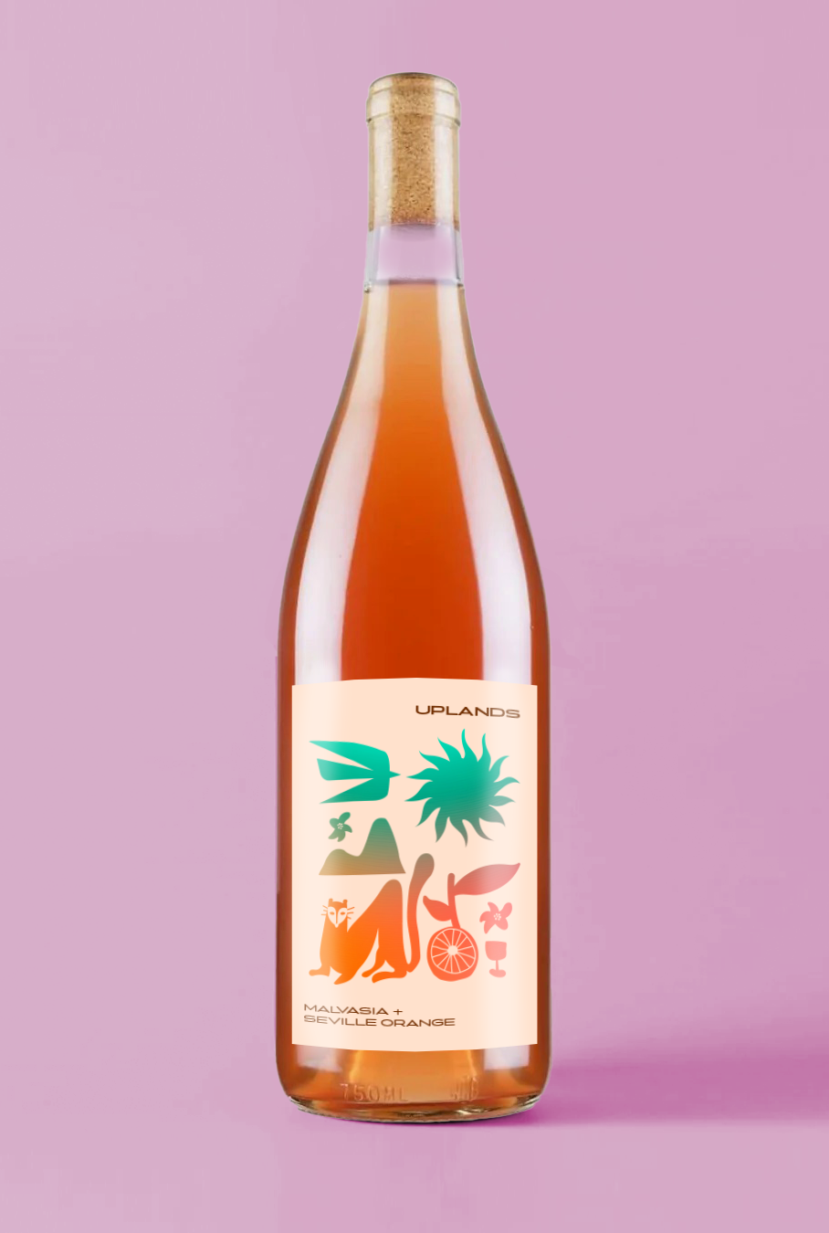
For his natural wine brand, we chose the name “Uplands” which directly speaks to the Arizona Upland biome of the Sonoran Desert from which all this wonderful juice comes from. Visually, we wanted to evoke images of the landscape (see: coati), as well as some lighter-hearted nods the vibe of the wine itself (see: pizza). The backfill is a spectrum meant to evoke the desert sunset and dusk.